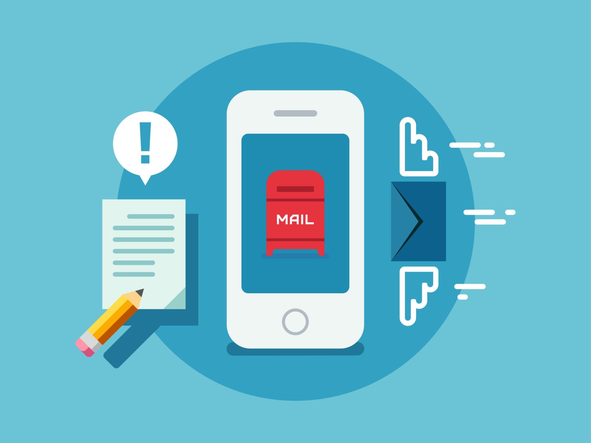

Research shows that 55% of email is now opened on a mobile device. If your email design isn’t optimized for mobile, it’s likely that the poor user experience is having a negative impact on your response rates. Here are 8 mobile optimization tips you can implement today to improve your results:
- Use responsive design. Emails that look just as good on mobile as they do on a desktop result in higher conversion rates.
- Keep subject lines short and pre-headers enticing. People will skip right past your email unless you convince them it’s worth opening.
- Be concise. Mobile users don’t have time to read a wall of text. Use headlines and bullet points to get your message across.
- Make sure images are quick to load. Resize them if they are taking longer than a second to appear.
- Test your emails. Make sure they are displaying correctly across all devices and browsers.
- Design for a small screen. Make sure text is legible and call-to-action buttons are large enough to click without having to zoom in.
- Offer an incentive. Include a promo code for your website or a mobile coupon that can be scanned when they visit you in-person.
- Optimize the landing page. When mobile users click through to your website, they should be greeted with a page that’s equally mobile-friendly.
Optimizing email for mobile users is vital to reaching your audience and maximizing your results. For help turning your email marketing strategy into one that works, contact our email marketing experts.


