Many people think that the process for getting a logo designed is: “I’ll tell them a bit about my business, show them my own idea, and then they will make it pretty on the computer and send me the files.”
Well, maybe that’s somewhat accurate. But we don’t design logos. We build brands and design brand marks for them. The process to create a strategic brand mark takes a lot of time, experience, and expertise to do right, so I’ll detail our usual process for it here using one of our clients, Charlie Papa Alpha, as our example.
Strategy first
The first thing we do is sit down with our clients and ask them all about their business, their customers, and their goals. In the case of Jaythan Williams, the owner of Charlie Papa Alpha (formerly Jaythan Williams Accounting), he told us that his accounting firm worked with a lot of expats and pilots, as well as a large number of other people working in the aviation industry.
We asked him what services he offered, and what feelings he wanted his brand to invoke in his prospective clients. He told us about the services first, then about his own history as a pilot. He knew all the ins and outs required to help people in the aviation industry get the best possible accounting.
After identifying that the brand needed to focus down on this very unique niche audience (people currently working in or with a history in the aviation industry), we also confirmed that the core concepts and feelings the brand needed to convey to this audience were the following:
- Trust
- Control
- Passion
- Success
- Vigilance
We further distilled the audience down into three main personas which can be summarized as:
- Flight Crew (anybody working for airlines)
- Expatriates (with a history in aviation, mostly pilots)
- Aviation Business Owners (usually pilots themselves)
Once we were armed with a strategic game plan for the brand we could launch next phase.
The three “R”s
If you guessed the three “R”s were “Research, Research, Research” you’d be correct.
During the research phase, we break the required information we’re looking for into three categories:
- Immediate Competitor Brands
- Global Industry Brands
- Audience Affiliation Brands
Immediate competitor brands are the ones that we are aiming to stand apart from. This gives us a good idea of who our client’s brand will be compared against by potential customers, and we immediately want ours to stand out the most. In the case of Charlie Papa Alpha, they were aviation-focused accounting companies across all of North America. We reviewed their web presence and brand marks to get a sense of who our client would be getting visually compared to.
Global industry brands are the “big dogs”. The companies that fall under our client’s broad industry description(s) that most people outside that industry would be aware of. For Charlie Papa Alpha, this was defined as the industries of “accounting” and “aerospace”.
Audience affiliation brands are brands that the client’s target audience would be not only familiar with but have some level of appreciation for, or connection to. In Charlie Papa Alpha’s case, those brands ended up being well-known aircraft manufacturers.
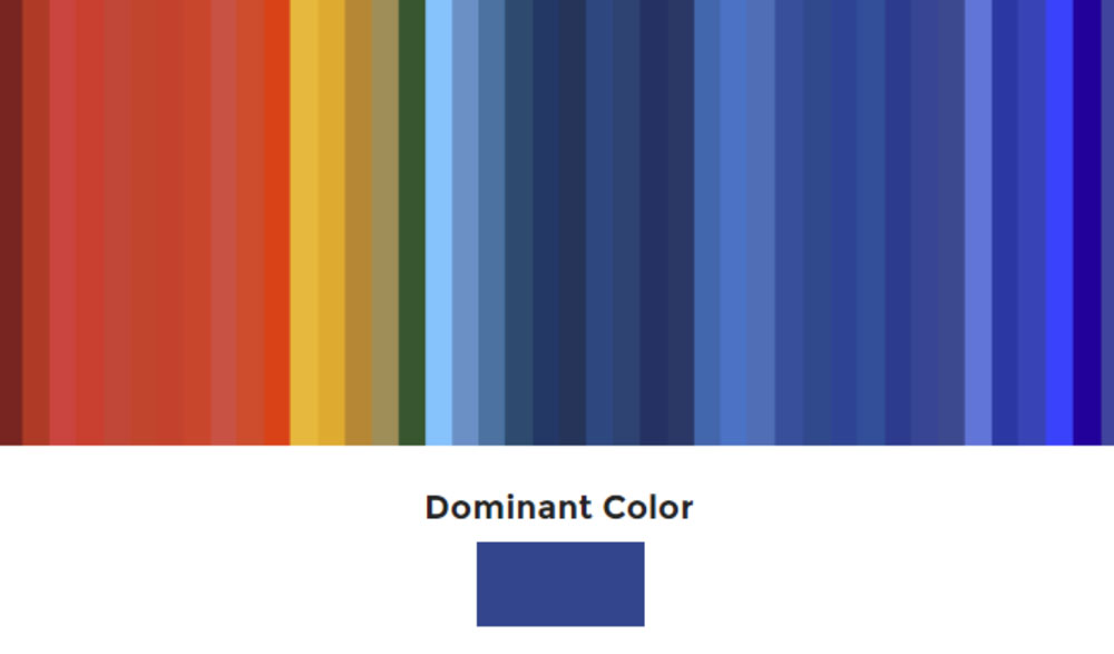
Once we have these brands identified, we assess their type, imagery, structure, and colours, among other things. We found blue to be so dominant in the brands sourced for Charlie Papa Alpha, that we created a colour spectrum to show just how it averaged out.
What’s in a name?
No spoiler tag necessary, here; you already know the name we landed on. Based on the strategy and research phases of our branding process, we knew that we wanted to make the name of Jaythan’s business stand out and speak directly to his niche audience. This isn’t part of most brand processes, since our clients rarely change their name, but this is where that service falls within the Loomo branding process when it does happen.
So we brainstormed on it, and leveraging our research, landed on two top choices: “George” (pilots’ ubiquitous nickname for the autopilot system in planes) and “Charlie Papa Alpha”, or CPA in the NATO phonetic alphabet. To most people, Charlie Papa Alpha just seems like a really random name for a company. For pilots, they just read CPA in their own language. This ticked both of our requirements: to stand out from the pack, and to connect with the target audience.
The Creative Process
Next, we start dreaming and drawing. I typically try not to waste paper, so we draft on whiteboards and our iPads until we have some really solid directions that I believe should make it to the next phase: digitization.
During this phase, we recreate our rough sketches into vector art (using Adobe Illustrator–the industry-standard) that is 90% complete. Usually, we deliver these proofs to the client for their first impression in black and white so that colour doesn’t play a factor in their immediate preferences.
Occasionally, there are minor tweaks to the favorite option, such as repositioning the logomark (or bug. If these are new words for you, discover the different components of a brand mark here). On a couple occasions we have to go back to the drawing board, and often there are no changes at all other than just adding colour into the equation.
We typically deliver 2-3 options. Technically, there is almost always one option that we believe is “the one that solves the design problem best”, but we have found that we don’t have the same clout as Paul Rand, so we provide options to give our clients the agency to make their own selection rather than just accepting a singular solution.
This is the solution Jaythan Williams selected, along with the condensed version for use on social media profile images.
Tints, Tones, and Typography
Once a selection is made, we narrow down the colour palette using a combination of brand research, colour theory matches for audience demographics, and intuition. We usually present two different palettes, and when one is chosen, we apply it to the brand mark for approval.
We also work on typography and the brand “tone of voice” (that’s the style in which your branded copy is written. Is it humorous? Thoughtful? Utilitarian?). Typography is selected to pair well with the brand mark and to help reinforce the feeling that the brand needs to visually convey to the audience.
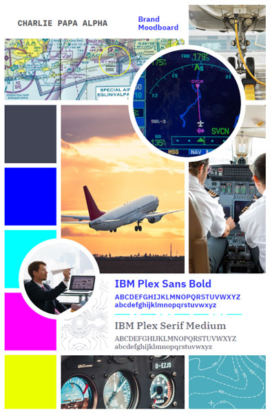
These three brand elements are placed in what we call a Brand Board, along with conceptual imagery and design elements, and sent over for review. We have modified our Brand Boards a little since then, but this is how CPA’s brand board looked:
Final Files
Brand marks aren’t delivered as one “hi-res JPG”. There are a lot of different scenarios that our clients need to use their brand marks in, so we try to think of everything.
You’ll need colour, black, and reverse (the version you use on top of dark backgrounds, which can be a lighter colour, or plain white) at least. Then, you’ll need EPS files (which are a math-based vector filetype) and PNG files (which are a pixel-based raster file type).
So, even if you only have one “version” of your brand mark (ie. No stacked versions, no tagline variants, no social media-specific versions, etc.), the bare minimum we would deliver is six separate files. One of our clients, WildPlay Element Parks, has over 20 files for their tagline alone!
Additional Brand Collateral
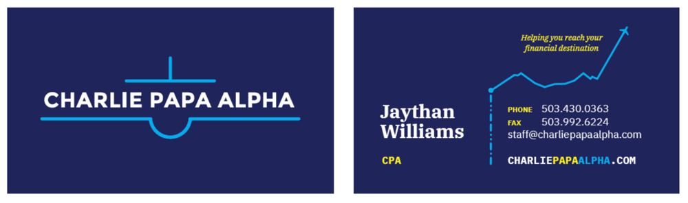
After the brand marks are complete, we’ll take on the design of other requested brand collateral. Sometimes it’s just a business card, and other times it’s an entire website, tradeshow booth, stationery set, and brand guidelines document. Here are CPA’s business cards.
TL;DR (this article in summary)
Yes, this process is a lot more involved than just requesting a “logo” on Fiverr or 99designs. We believe you really do get what you pay for, and that a brand identity built on these five foundational processes will bring in more business long term than a company that doesn’t invest in doing it properly:
- Brand strategy
- Brand, audience, & competitor research
- The creative process and mastery of illustration
- Expertise in colour theory, brand tone, & typography
- Experience with the proper file types for real-life contexts
If your business never had that opportunity, or you want to start up your startup strategy-first, I’d be happy to chat with you about it. Connect with us here.