BRANDING | WEB DESIGN | MARKETING
Client Name
Peoples Group
Websites
peoplestrust.com
peoplesbank.ca
Market
Canada
Year
2014-2020
Categories
Financial services
It’s not often you get to work on branding an FI from the ground up. With Peoples Group, we were given a chance to not only create new brand assets but help define who the company is and where they are going. For 6 years, we were happy to play an integral role as People Group’s external marketing team, working closely with the C-Suite on all campaigns and projects.
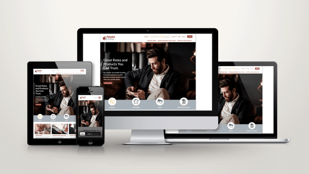
In our tenure, Loomo worked to research and grow the Peoples’ internal and external brands, running hundreds of campaigns, seeing significant annual growth, and developing two new corporate websites including Canada’s first fully responsive site for a financial institution.
Brand Strategy
Brand Development
Graphic Design
Responsive Website Design
Marketing Strategy
Digital Advertising
Sometimes when opportunity knocks, you’re not sure where it will take you. Such was the case with Peoples Trust. When we first sat down in 2014, they had just been offered a chance to take over an incredible retail location on the main floor of the Peoples Group tower in Vancouver. Having never had a brick-and-mortar location, going the path of retail – and everything that comes with it – was daunting. On top of that, the brand was considering a major regulatory and name change. With such big changes coming, we recognized right away that there were important questions that needed to be addressed about how the Peoples brand, and market share, would be impacted.
To help, Peoples asked Loomo to perform a full-scale brand audit and help define the brand from the inside out. The results created a framework for a refreshed brand, including an exciting new retail space, advertising presence, and website redesign.
Since then, our work has spanned everything from brand and market research to strategic planning to brand design and marketing implementation. Our work required us to integrate with internal marketing, IT, and executive teams to ensure brand creative and messaging were consistent and effective while providing ongoing technical support for the Peoples website and digital assets.
The key to any branding project is to fully understand what makes one “brand” different from all others. We’re not talking about colours and logos. We’re talking about what comes to mind when you think about any company. Is it a fond customer service memory? Do you trust them to do what they say? Would you recommend them to someone else? Why?
Such details are the essence of any brand and key to knowing if you are on the right track or need to make some serious changes.
For Peoples, Loomo conducted six months of intensive research with audiences and stakeholders across three lines of business. This offered insights into the brand that Peoples had never previously explored. For instance, while customers rarely engaged the brand face to face they expressed a deep commitment to the brand and staff. The most common brand descriptions were “personal, trustworthy, and reliable”. Echoing this, NPS scores were significantly higher than the industry average. For a brand not yet sure of itself, Peoples had managed to foster strong brand loyalty.
With brand research in hand, we began comparing client experiences of the company to the overall corporate vision. This allowed us to easily identify any changes to brand assets, messaging, and marketing strategies that may be required.
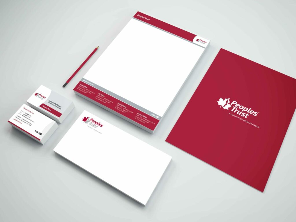
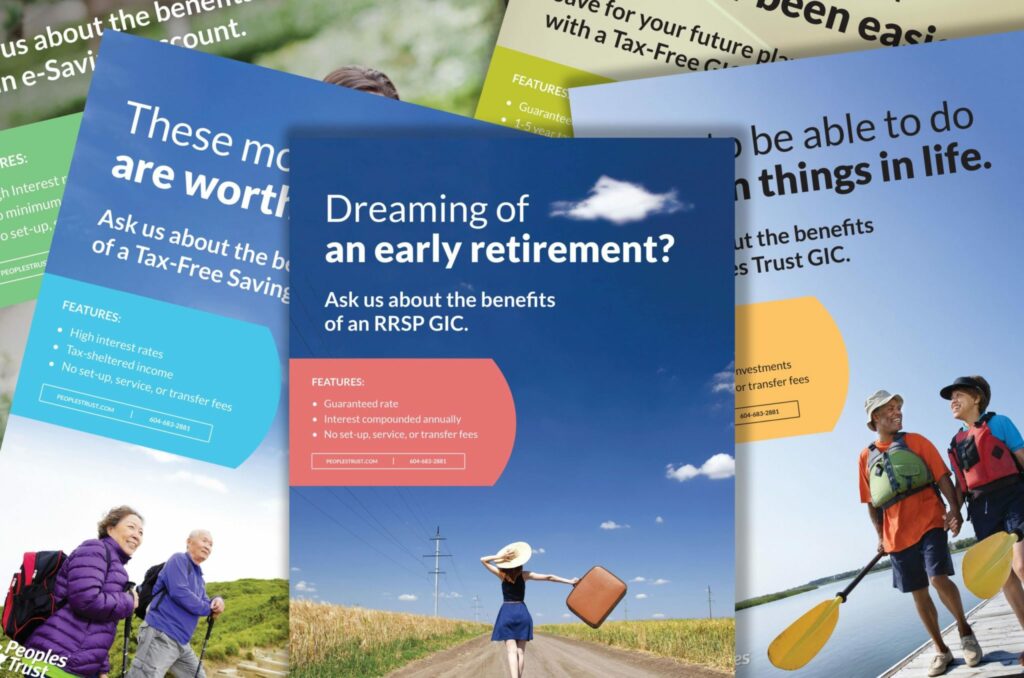
After completing our research, we started working on how to present the brand in a way that was consistent with our findings and the newly defined vision for the organization. To accomplish this, we developed style boards that laid out a visual system for the whole organization, identifying colours, typography, visual elements, and photography cues across three lines of business.
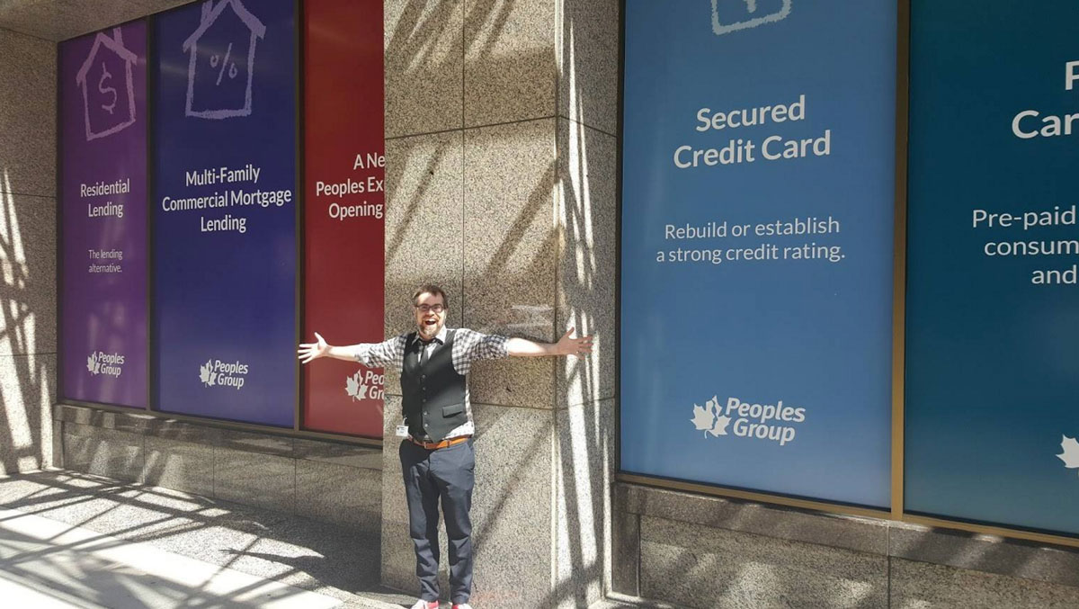
We approached colours from a different perspective than usual. Peoples Group consists of a number of different subsidiaries, each offering different products or services. To accommodate all of the sub-brands under one roof we used colour to delineate in an intuitive way. All mortgage-related services and products are in the purple family. Card related products fall under the blue-grey family. Payment Solutions, uses bold grays for their brand, while all deposit related products have received a bright and varied colour palette, where each product has its own tone.
These colour palettes play nicely when viewed in proximity with each other (in rack cards and brochure stands for example) but also demonstrate the concept of variety in a way that really speaks to the Peoples brand.
Finally, we created a system for iconography and photography. We generated custom hand-drawn icons for every product and division at Peoples Group. These icons can be found as watermarks on brochures, page headers, and window decals (as seen above), but we also use them for more direct icons on website portlets. These illustrations are used in a delicate balance with the photographs in various collateral.
“[You have] an amazing team at Loomo! Thanks so much for bending over backward for us.”
John Pals / VP, Marketing & Innovation

Finally, as the primary means of engagement with current and potential clients, the Peoples website was in desperate need of updating. Using a non-responsive framework left mobile users (over 60% of their traffic before the site was updated) frustrated. Clients seeking product information would easily get lost, trying to find pages that were hidden behind multiple layers of links and site content.
From a brand consistency perspective, four brand websites also needed to be compiled into a single, user-friendly experience, equally capable of marketing merchant services to businesses across North America or servicing everyday account holders with their personal investments or savings.
For half a decade, Loomo has been a key brand, marketing, and web development partner for all of Peoples’ initiatives. With four lines of business in three major Canadian cities, you can imagine that the daily marketing and creative needs can pile up quick. Along the way, we have been proud to be there for some of Peoples’ most exciting transitions, and look forward to more right around the corner!
PS – If you want to take a swing by and see some of our handiwork. The fine folks at 888 Dunsmuir in Vancouver are always ready to brew up a cup of coffee, or tea if that is your thing!