BRAND RESEARCH | GRAPHIC DESIGN | MARKETING
Client Name
Salmon Arm Savings & Credit Union
Market
Western Canada
Year
2016-2020
Categories
Financial Services
We first encountered the fine folks at SASCU (formerly Salmon Arm Savings & Credit Union) when they discovered our No-Fee-Super-Free campaign offer for credit unions.
We were excited to do a free campaign for them (check out that sample below!), and quickly dove into their site and brand materials. During our discovery process, we noted that there were several disparate brand elements impacting brand consistency and messaging.
Acknowledging that it had been a number of years since they had undergone their re-brand to “SASCU”, they asked us to come visit them in Salmon Arm to help align their branding through a brand refresh project.
Brand Research & Strategy
Graphic Design
Marketing Creative
Our research for SASCU utilized a variety of quantitative and qualitative methods, engaging a range of internal stakeholders and external sources including:
In addition, thorough competitor analysis in regards to branding, audience targeting, and existing marketing and communication strategies provided valuable data regarding where the competition was spending their money in Salmon Arm and the surrounding areas.
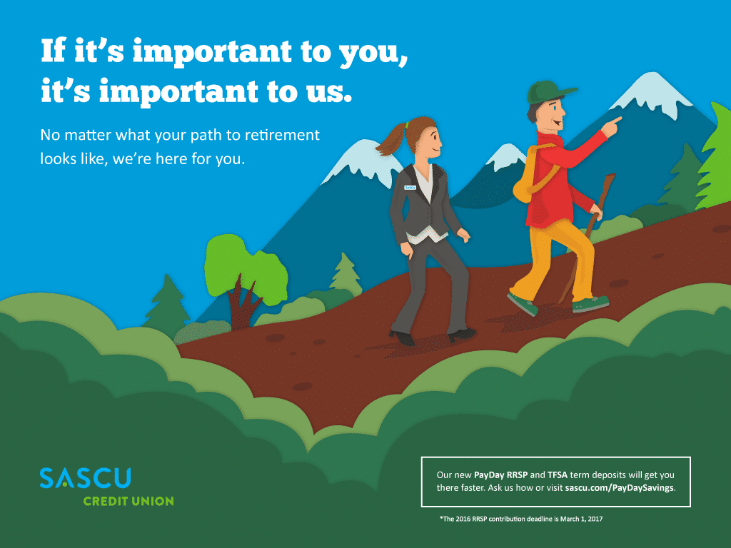
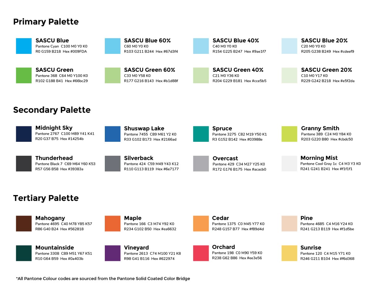
On-site visits provided a fantastic opportunity to draw inspiration from the physical location, community, and surroundings. In fact, the basis for our final background patterns and a few secondary colours came directly from decor at their modern, award-winning Uptown branch.
The initial re-brand (conducted by a previous firm), while extremely well-executed, was relatively limited in terms of how much variety there was for colour, texture, and text.
We knew that the first thing we’d do – with 100% certainty – was to expand the colour palette. A lot.
The original colour palette was limited to Black, White, SASCU Blue, and SASCU Green. There was nothing wrong with those, so we made them the “Primary Palette” with specific tints for versatility. Then we got really creative, building out extensive secondary and tertiary palettes to complement the rest of their materials.
The purpose of the font families we selected for brand and marketing purposes was to complement the feeling of SASCU’s overall brand identity. They are clear, legible, resistant to dating and they have enough diversity and versatility to work with a variety of different layouts.
Montserrat was chosen as our “square” typeface, used for headlines; it puts the professional foot forward in all materials. Nunito Regular, our body copy selection, was our “round” typeface; it was chosen to create balance by incorporating a softened, approachable build.
We also decided to create background patterns for each of SASCU’s various lines of business; they would add visual interest to simpler creative in a subtle way that doesn’t distract from the message. The patterns were inspired by textiles and furniture located in SASCU’s Uptown branch, which we felt would be a cool discovery if anybody made the connection while waiting in line to do their banking.
The “pulse” was the name of the primary graphic element we adapted to tie together everything from web banners and print materials to credit cards and other branded documents.
Based on the outcropped “A” from their previous re-brand, it was redesigned to be used with different colour combinations taken from the primary, secondary and tertiary palettes, (although its default combination is SASCU Green, Shuswap Lake, Spruce, and SASCU Blue as seen in the “Classic” credit card on the right.)
Member testimonials are an excellent way to add credibility, and relatability, to campaign messaging. The tricky part is getting pictures of your members for each campaign while having your ads stand out from the competition. We opted for providing a simple way to feature any member while offering brand differentiation from the competition: The Custom Caricature Creator.
The C3 is an extensive Adobe Illustrator file with dozens of layers, each containing facial, clothing and hair elements to quickly and easily create a wide range of client avatars. This allowed us to create extremely stylized caricatures that were both on-brand every time, consistent in quality (which can crop up if you don’t have the same photographer/set all the time).
Once the brand elements and the C3 were ready to go, we also created a library of icons for use on banners, posters, and the website. Then we had some fun, creating a wide range of use-cases that gave SASCU a cohesive “set” of brand guidelines and elements to use in their upcoming marketing campaigns.
We really enjoyed working on this project (Luke even noted it as one of the top 3 highlights of his career), and are extremely excited for the future SASCU has in store!
Monday 8am- 5pm
Tuesday 8am – 5pm
Wednesday 8am – 5pm
Thursday 8am – 5pm
Friday Closed
798 Fairview Rd #4
Victoria, BC
(250) 800-1159
[email protected]
8661 201 Street 2nd floor
Langley Township, BC
(604) 210-5592
[email protected]