
Ever wonder why your online store isn’t converting as many browsers into buyers? The potential unseen barrier standing between you and better sales might be checkout issues. For a business, this can be the sole determining factor between thriving or barely surviving. The checkout page needs to be as seamless and inviting as possible because it’s where customers make their final commitment.
The reality is that most checkout pages have a number of problems that lead users to abandon their shopping cart. By resolving these checkout issues, you can significantly raise the number of visitors who will click “buy” instead of leaving your website. Resolving these checkout dilemmas will help you increase conversion rates and allow for higher overall satisfaction from customers.
Identifying Common Checkout Issues
Time to shed light on some common barriers that could be weighing your conversions down:
- Slow Loading: If a page takes too long to load, people become impatient and leave it. Quick loading makes all the difference when it comes to retaining potential buyers on your site.
- Complicated checkout forms are another case. Too much information or too many fields may make customers’ heads spin. Simplifying forms in such cases will more likely encourage users to continue.
- Hidden or surprise costs: Surprise fees at checkout from unexpected shipping costs generally scare customers away right when they are about to buy. It is easy to avoid this by being transparent from the outset.
These are just some of the hurdles businesses face in trying to seal the deal with customers. Finding these types of checkout problems and dealing with them early will lead to you having a smoother, more efficient experience that will encourage people to complete their purchases.
Simplifying the Checkout Process
After having nailed the common obstacles on your checkout page, the next step involves making the process as smooth as possible. A complicated checkout procedure will surely frustrate potential buyers enough to make them abandon their carts. The following are some of the ways to make it more user-friendly and reduce those checkout issues.
First of all, reduce the number of form fields. Only ask for information that is absolutely necessary to finalize the transaction. Provide a guest checkout option, too. In this way, those customers who do not want to register will also get the chance to easily complete their purchase. For an even easier process, allow auto-fill options, letting buyers quickly and easily enter their billing and shipping information.

These adjustments can significantly enhance the user experience during checkout. With less resistance, customers are more likely to complete their shopping journey and increase your conversion rates.
Enhancing Trust and Security
Customer trust forms the basis of purchases made online, particularly with security concerns increasingly becoming a major talking point. Increasing trust will reduce cart abandonment and make sure consumers know their sensitive information is safe with you.
Including security badges on your checkout page showcases that customers’ data is safe. Clearly spell out your policies, indicating how personal information is handled. When customers see options for reputable methods of payment, trust in your checkout process increases.
For example, integrating widely used payment options like PayPal or trusted credit card networks shows your customers that you take security seriously, making them much more comfortable when it comes to completing their purchase. A secure environment turns visitors into loyal customers.
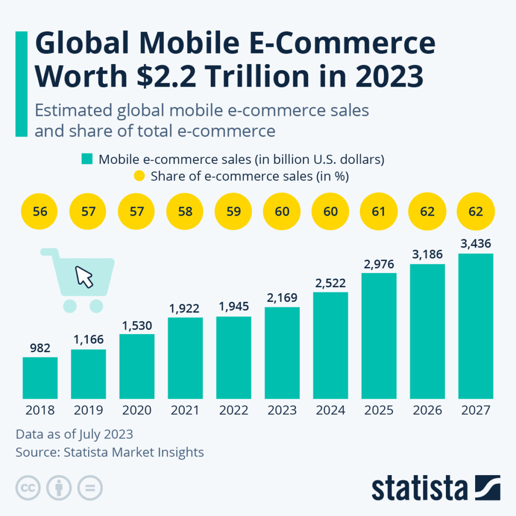
Mobile Optimization for Checkout Pages
With more and more transactions happening on mobile devices, making sure your checkout page is mobile-friendly will be crucial. What this demands is not just responsiveness in design, with transitions across different screen sizes, but also ease of navigation to suit the mobile user. Failure to optimize your checkout page for mobile may create a variety of checkout issues for visitors.
Responsive layouts should seamlessly adapt the content without distortion. Make buttons thumb-friendly and tappable, keeping in mind the spacing of those buttons. Simple navigation gets users through checkout without getting lost. Make it mobile-friendly to engage your users through payment.
Personalized Recommendations for Vancouver Businesses
For those operating in Vancouver, some customized tweaks can make all the difference. Knowing your local audience means you can personalize several aspects of the checkout experience.
Consider adding local payment methods that are comfortable for the customers in Vancouver. This way, the transaction time could be faster and more familiar. Relevant shipping options should also be offered to cater to the local market.
Utilizing region-specific promotions can attract local customers, offering them a reason to complete their purchase. These approaches not only attract the community but also solidify your position in the local market.
Elevate Your Checkout Page to Boost Conversions
Optimizing your checkout is a continuous process, full of attention and creativity. By identifying what is going wrong and taking it on head-first, you will pave the way for smoother and more efficient transactions. Emphasizing mobile optimization, fostering trust, and offering personalized experiences are key elements that improve conversion rates. With these insights, you’re well on your way to turning a problematic checkout into a powerhouse of conversions.
Ready to elevate your online store’s performance? Experience how Conversion Optimization can transform your checkout process and lift your sales. With Loomo, turn obstacles into opportunities and craft a seamless shopping experience that will keep them coming for more. Contact us today to see how a few strategic changes can make a world of difference.