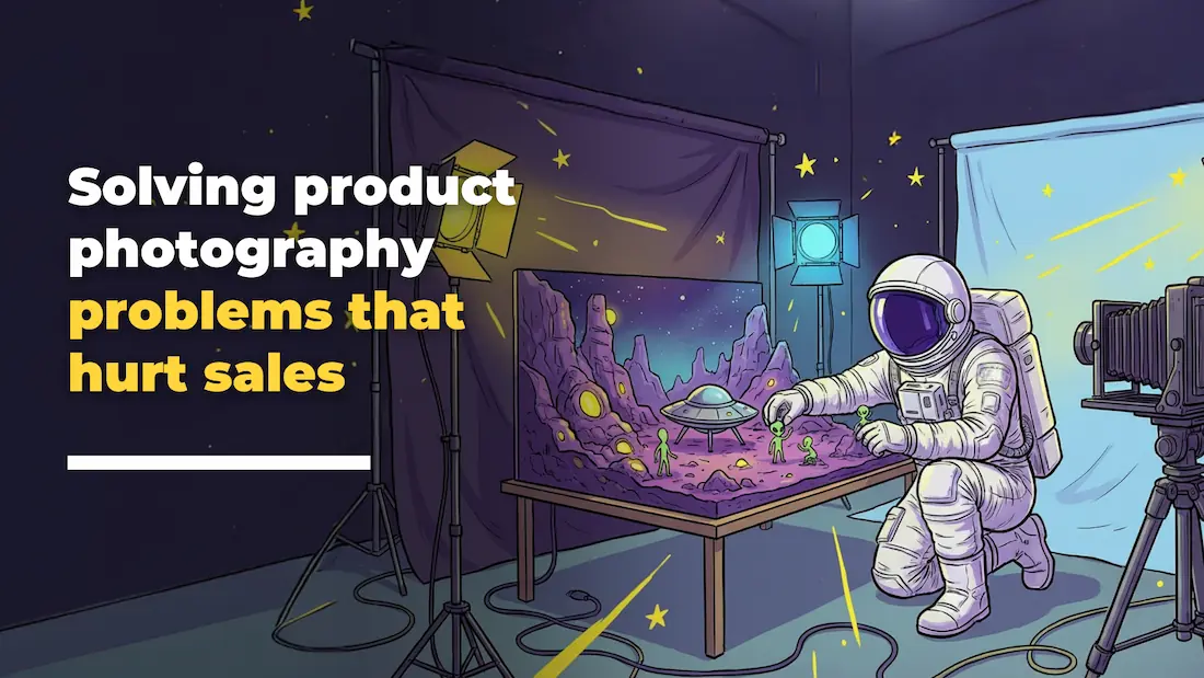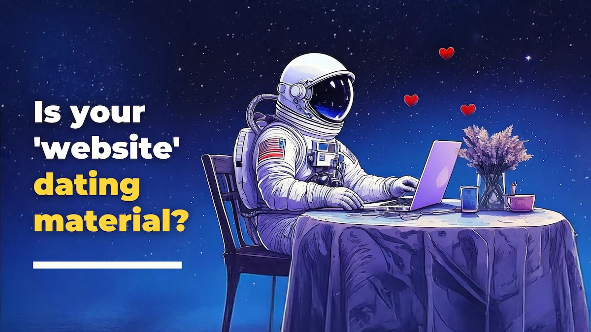

First Impressions Matter
Your website is like an online first date. Are visitors swiping right or ghosting you immediately? Just like in dating, first impressions online are everything. If your website gives off the wrong vibe, potential customers won’t stick around. Enter “the ick”, those little turn-offs that make visitors bounce faster than a bad Tinder match. Let’s talk about what’s turning them off and how to make your site commitment-worthy.
Red Flags: Signs Your Website Is a Walking Ick
🚩 Slow Load Time: If your site loads like a date who’s running 15 minutes late, visitors will move on before you even show up. Google recommends a 3-second load time – any slower, and you risk losing traffic. Studies show that a one-second delay in load time can lead to a 7% drop in conversions.
🚩 Outdated Design: Still rocking a 2010 look? Visitors will assume your brand is just as outdated. Modern, clean designs build trust and engagement.
🚩 Cluttered Layout: Think of a chaotic dating profile, too much happening, no clear direction. Your site should be easy to scan, with a clean and intuitive flow.
🚩 Hard-to-Find Info: If your visitors have to play detective to find your contact info, pricing, or key details, they’ll give up and look elsewhere. Research shows that 44% of visitors will leave a website if they can’t find contact details easily.
Green Flags: How to Make Your Website Irresistible
✅ Speed it Up: Optimize images (we SWEAR by Squoosh), clean up your code, and ensure your site loads in under 3 seconds. A fast site is an attractive site. Google’s PageSpeed Insights can help analyze and improve site performance.
✅ Modern, Clean Design: Fresh fonts, a simple layout, and a mobile-friendly experience will keep visitors engaged. Take inspiration from brands like Moncler, which use clear messaging and an intuitive user interface.
✅ User-Friendly Navigation: Organize your site logically by thinking of it like a great conversation flow. Visitors should know where to go next, not wonder why they are there in the first place.
✅ Clear Calls-to-Action: Don’t leave visitors wondering what to do. Make sure your CTAs (Contact Us, Buy Now, Learn More) are clear and compelling. Studies indicate that personalized CTAs convert 202% better than generic ones.
(Related: The Love Languages of Branding: Speak to Your Customers’ Hearts, Not Just Their Wallets)
Commitment-Worthy: Building Trust with Your Audience
💙 Great Copy & Brand Voice: Speak directly to your audience in a way that feels personal and relatable—ditch the robotic jargon. Brands like Mailchimp use a conversational tone that makes them approachable and engaging.
💙 Testimonials & Social Proof: Highlight happy customers and positive reviews. Nothing’s hotter than credibility. Case studies show that adding testimonials can increase conversions by up to 34%.
Speaking of testimonials, have you seen our latest video featuring feedback from our partners at the Downtown Victoria Business Association, Luminus Financial, Duncan Wardle, and Smart Attend?
💙 Seamless Mobile Experience: If your site isn’t mobile-friendly, you’re missing out—over 50% of web traffic comes from mobile users. Google prioritizes mobile-friendly sites in search rankings, so ensure your site is responsive and easy to use on all devices.
Conclusion: Put a Ring on It (or at Least Get a Second Date)
If your website is giving visitors the ick, it’s time for a glow-up. Fix the red flags, focus on user experience, and watch engagement grow. Need help making your website a keeper? Loomo’s here to help because everyone deserves a second chance at love (or at least a higher conversion rate).
Let’s build a website that turns visitors into lifelong fans. 💍✨